Restaurant Setup and Configuration
Year: 2026 Role: Product Designer Scope:Information
Architecture, UX/UI, Mobile Responsiveness, Usability Validation Team: Product Manager, Frontend
Developer, Backend Developer
Redesigned the restaurant admin panel to fix broken navigation and
speed up routine menu edits. It removed key objections during sales
demos and let new partners set up their stores without relying on
account managers.
Problem
The old admin panel was hurting both sales and onboarding. Prospective
partners lost interest during demos because the UI looked outdated next
to competitors, while signed clients kept getting lost in complex
navigation and calling support for basic tasks. On top of that, managers
couldn't adjust settings on the fly from a phone, which competitors
already allowed.
Insights
Through support logs and interviews with restaurant managers, I mapped
out where people were getting stuck. Simple daily routines were buried
deep in settings, navigation triggers were misleading, and basic tasks
like updating store hours took way more steps than they should.
Defining the architecture
Before designing the widgets, I explored high-level layout mechanics to
consolidate the scattered settings. The goal was to find a standard,
reusable pattern that would speed up development and make configuration
fast. I mapped out three conceptual approaches:
Full-page form
Handles massive amounts of data, but feels too heavy for quick,
frequent edits.
Vertical Accordion
Works well for linear onboarding, but forces unnecessary scrolling
when jumping between unrelated sections (e.g., from Location to
Hours).
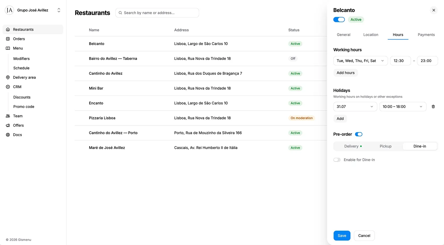
Slide-out Drawer (Selected)
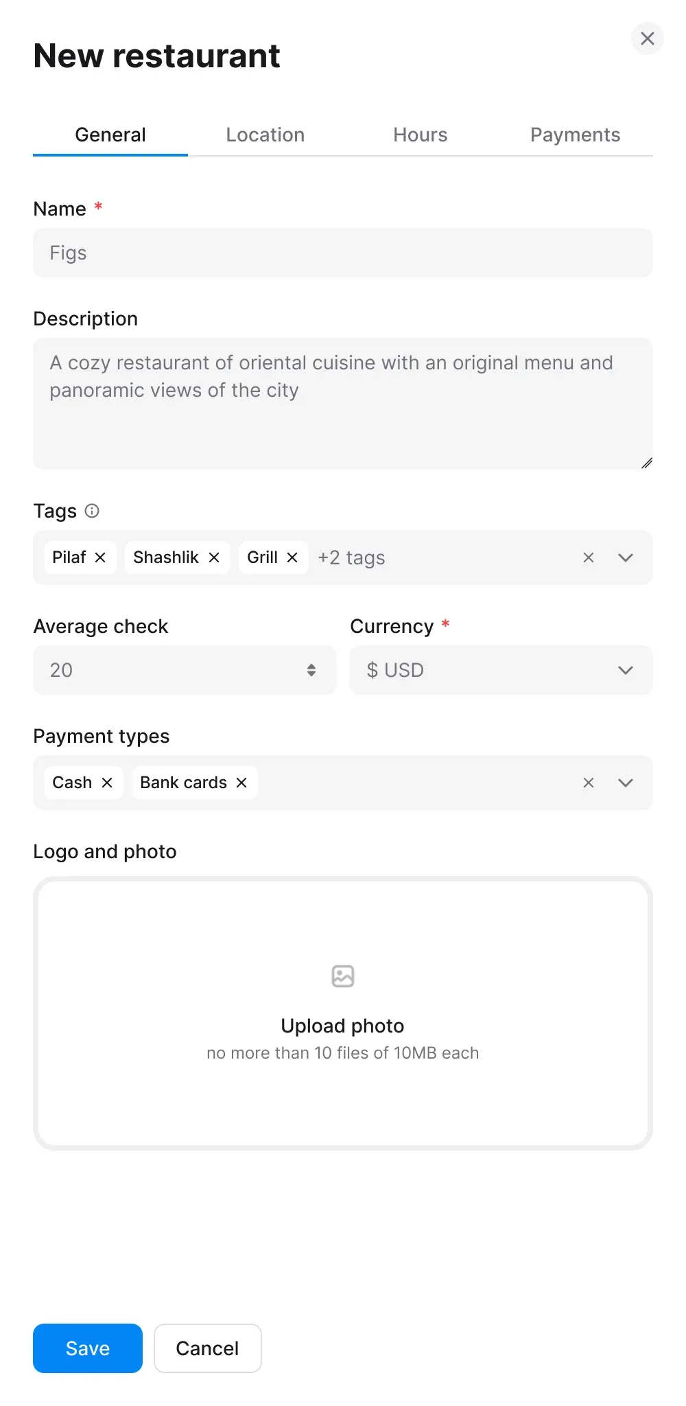
New restaurant
General Location Hours Payments
Keeps the main restaurant list visible in the background. It allows
for quick, isolated edits without a page reload and naturally
separates different contexts using tabs.
I chose the Slide-out Drawer after checking in with the dev team. It
kept the main list in context for users, proved straightforward to
implement on the frontend, and easily scales down to mobile screens.
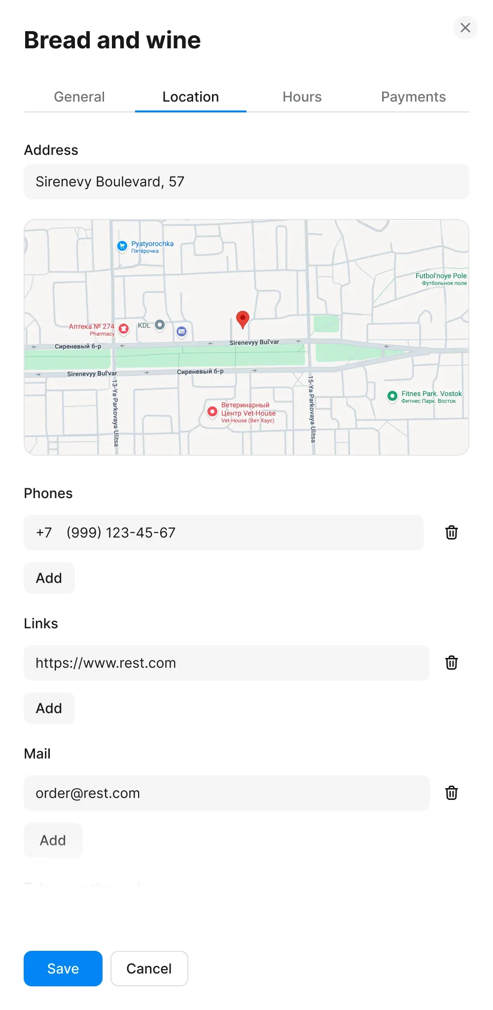
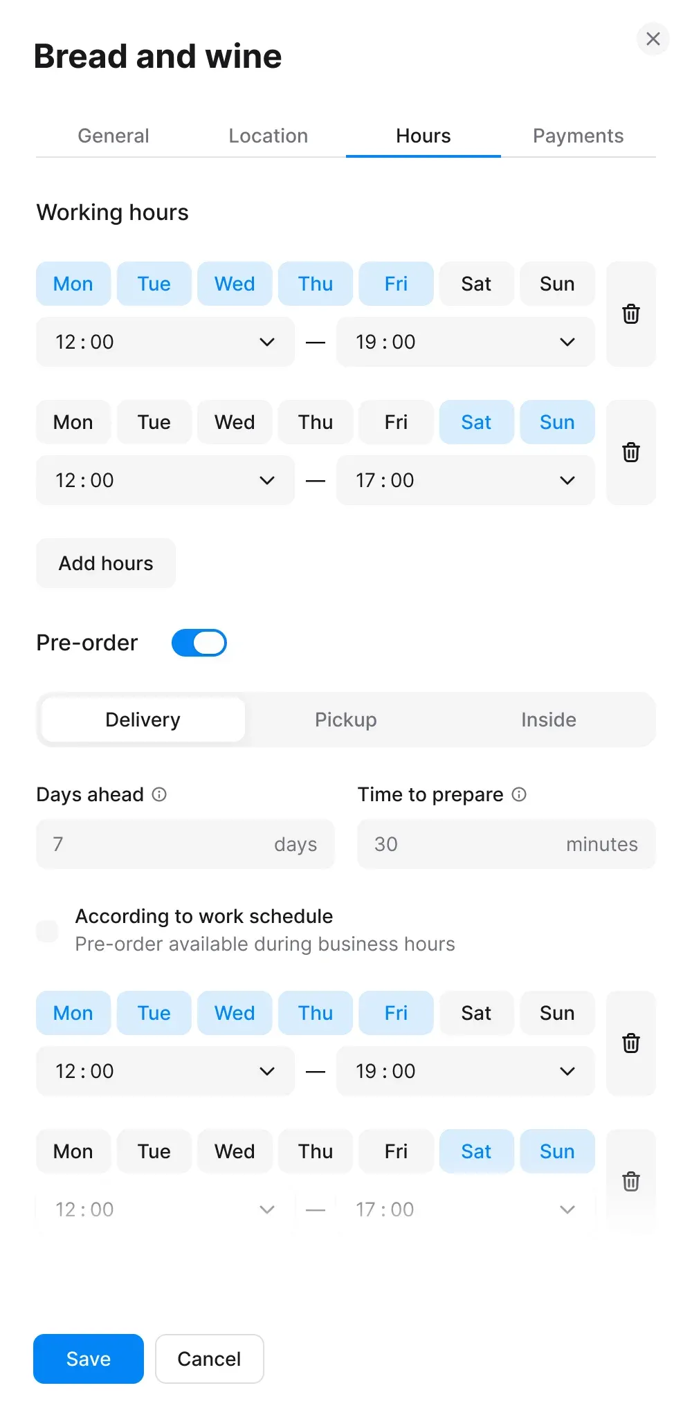
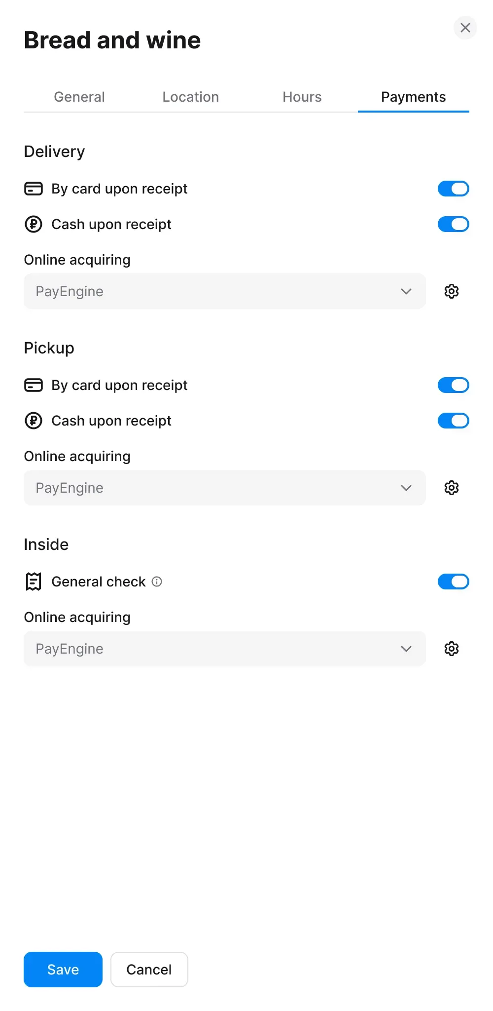
Consolidating settings into tabs
Instead of one long form, I organized the store settings into four
logical tabs: General, Location, Hours, and Payments. This keeps the
drawer compact, speeds up navigation between sections, and ensures users
always maintain their operational context in the background.
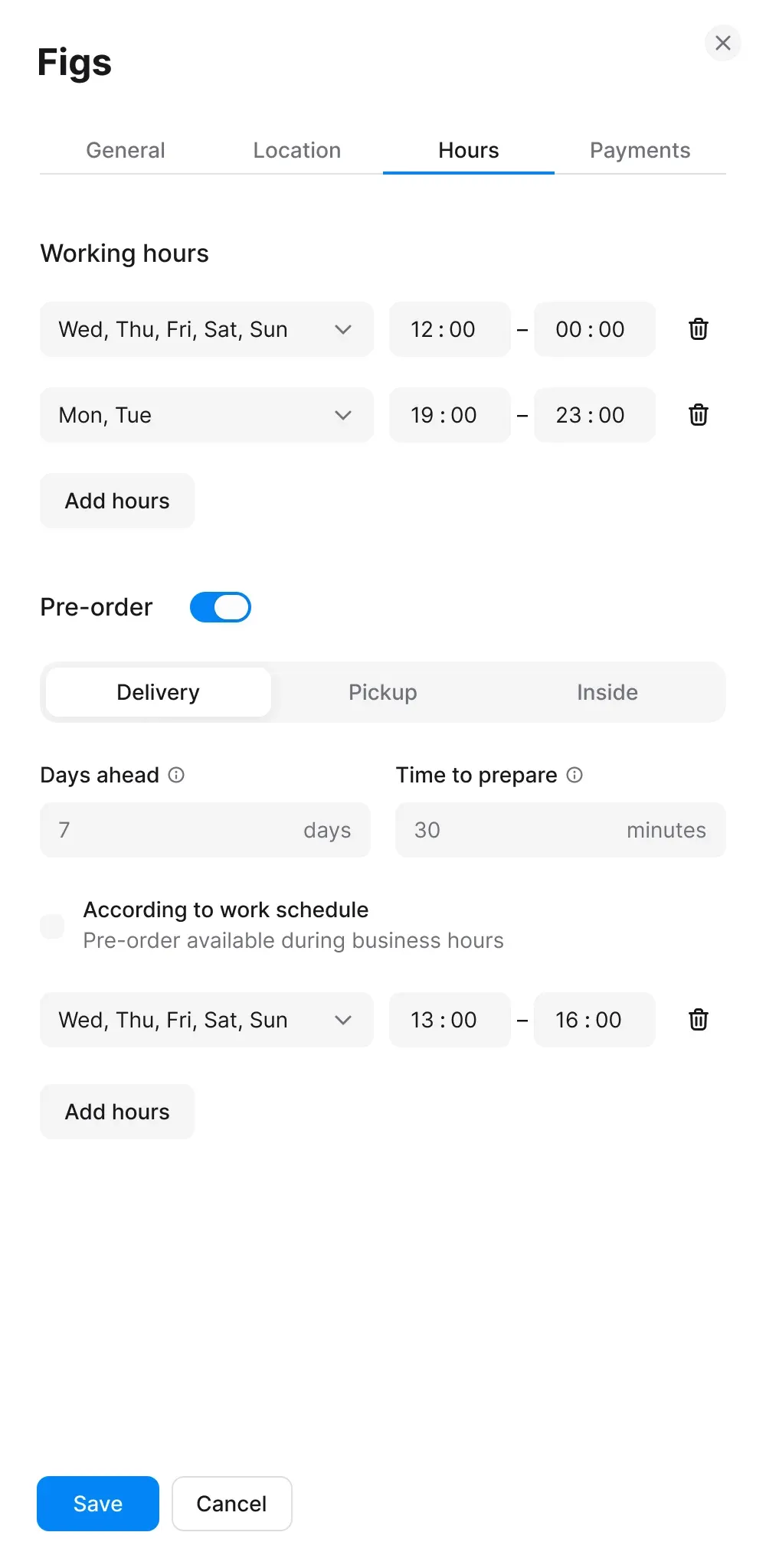
Cleaning up
To keep implementation lean and avoid visual clutter, I replaced seven
individual day toggles with a single multi-select dropdown. Working
closely with engineering, this simplified component saved development
effort while freeing up UI space for the pre-order logic below.
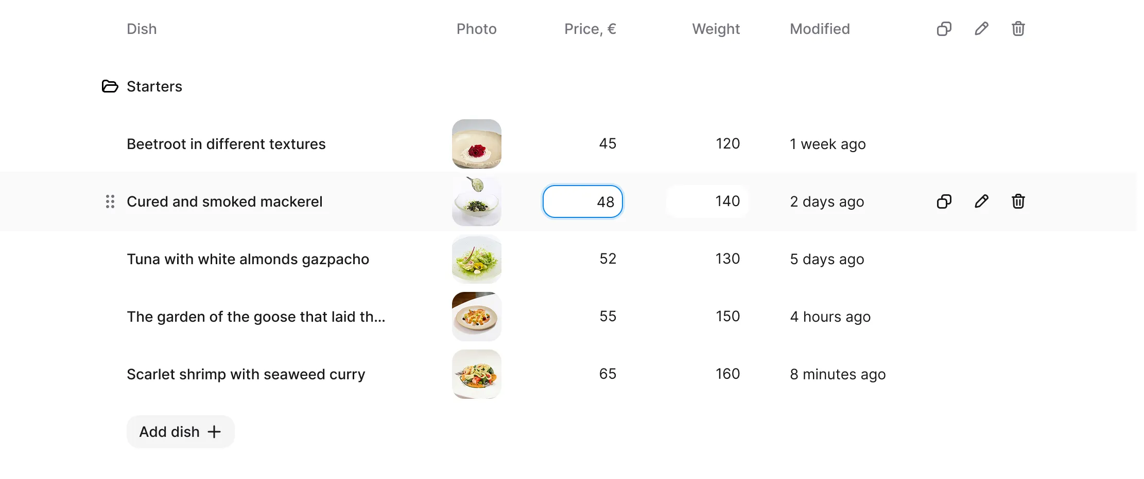
Simplifying menu management
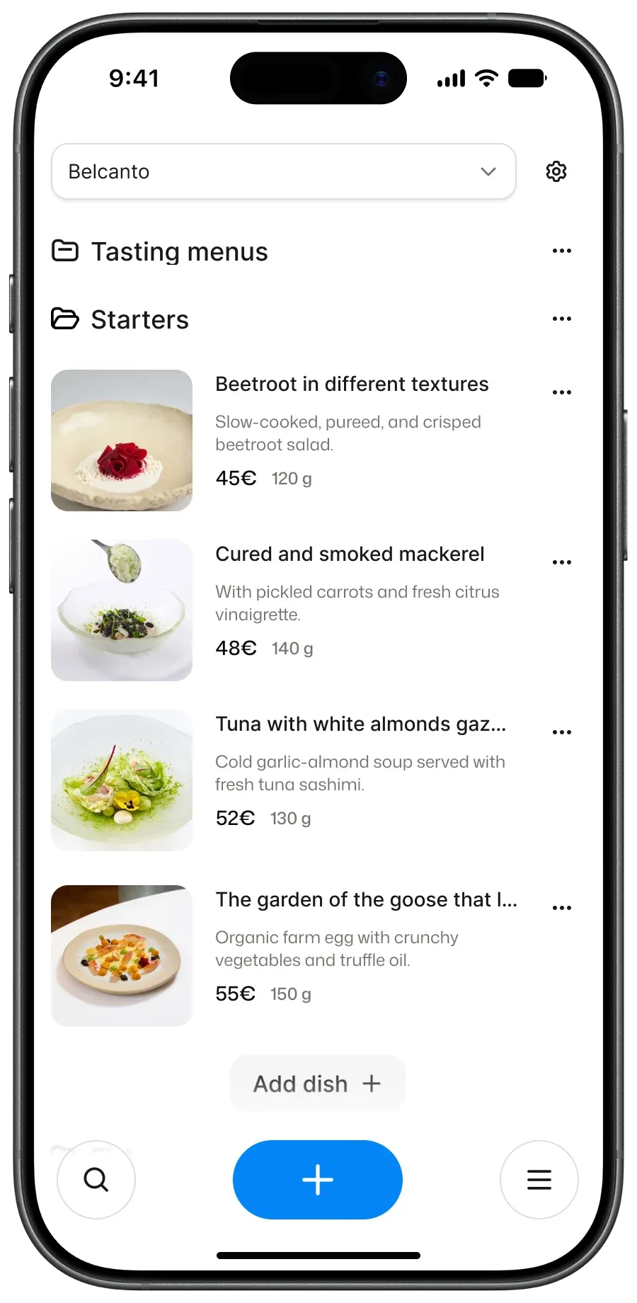
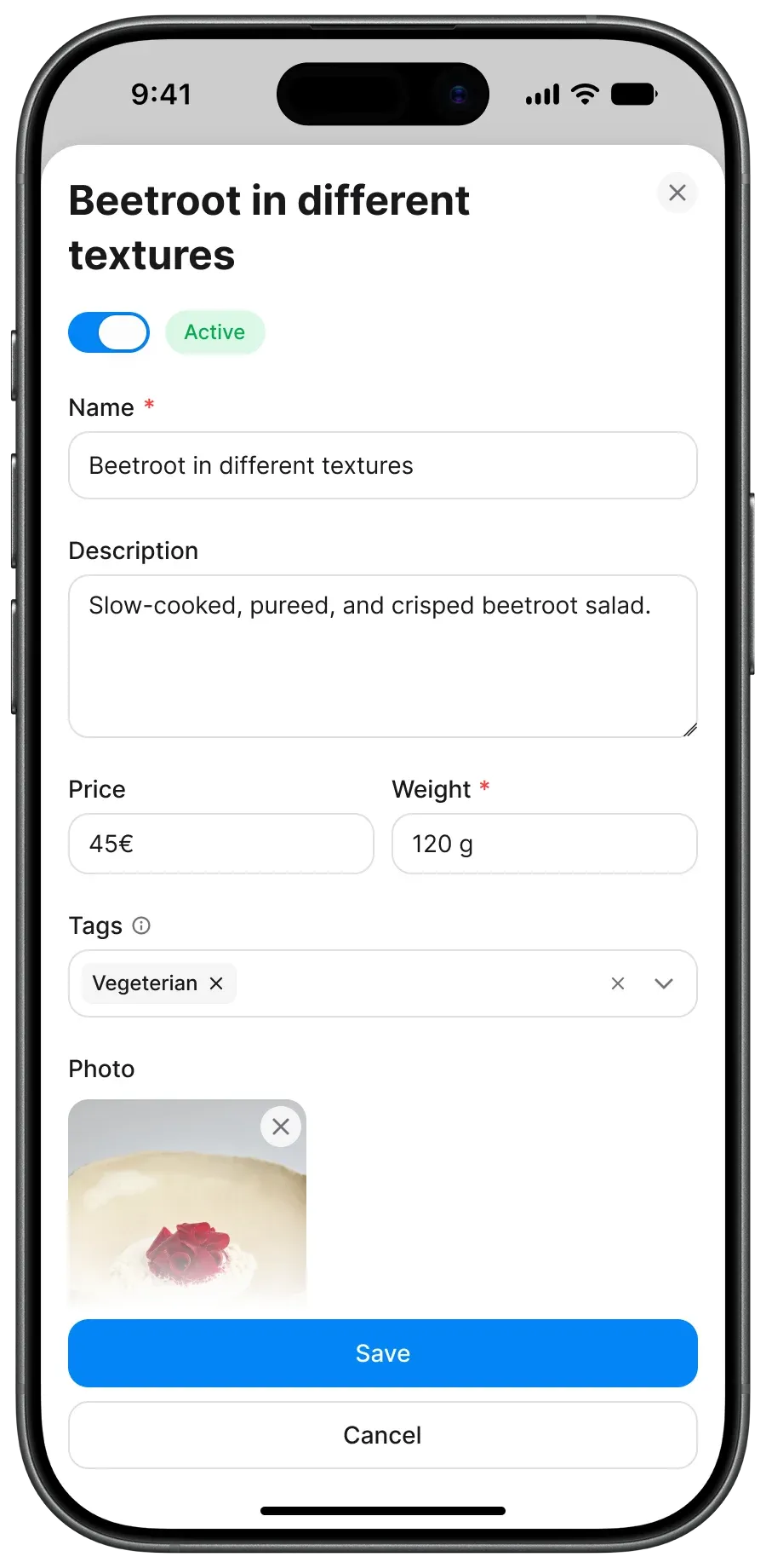
For the menu section, I focused on reducing steps for everyday tasks.
Clicking a menu row now opens its dish list directly instead of buried
settings. I brought price, weight, and availability edits straight into
the table, so managers don't have to open full product cards for quick
updates. I also added drag-and-drop reordering instead of clicking
arrows, placed the "Add Dish" button inside the active category, and
introduced hover image previews.
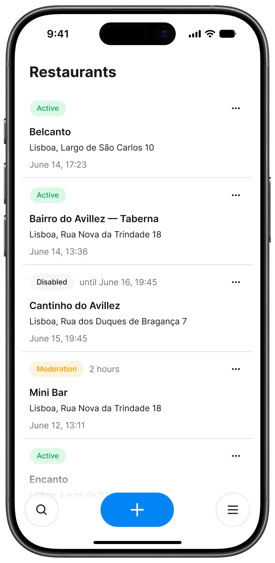
Adaptive card layouts
To keep the admin panel functional on mobile without horizontal scrollbars,
I converted the restaurant and menu tables into responsive card views.
Combined with the drawer pattern, managers can now easily handle daily
store adjustments directly from their phones.
Outcome
We validated the redesign through follow-up interviews and feedback from
account managers:
- Self-Serve Onboarding: In usability tests, 90% of
users successfully configured their store and created a menu on their
first try without calling support.
- Reduced Support Load: Account managers reported a
drop in basic "how-to" calls regarding navigation and price edits.
- Mobile Management: Restaurant managers gained the
ability to handle urgent daily tasks — like pausing a store or
toggling dish availability — directly from their phones.