Year: September 2023 — September
2025Role: UX/UI DesignerTeam: Project manager, frontend
developer, backend developer, mobile developer
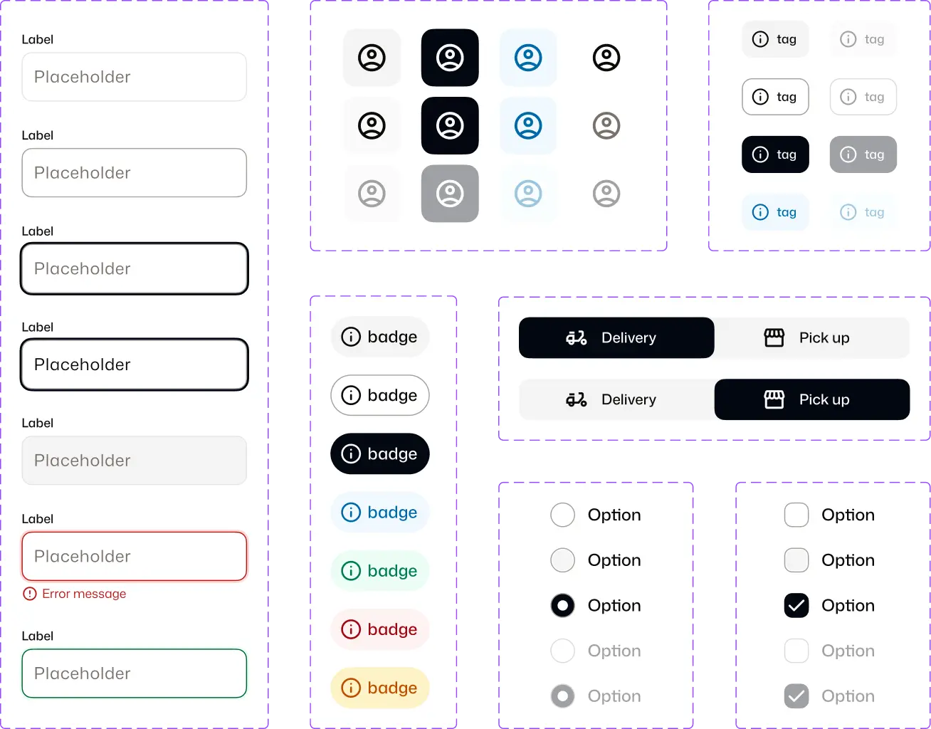
Figma
Design system
Mobile
Web
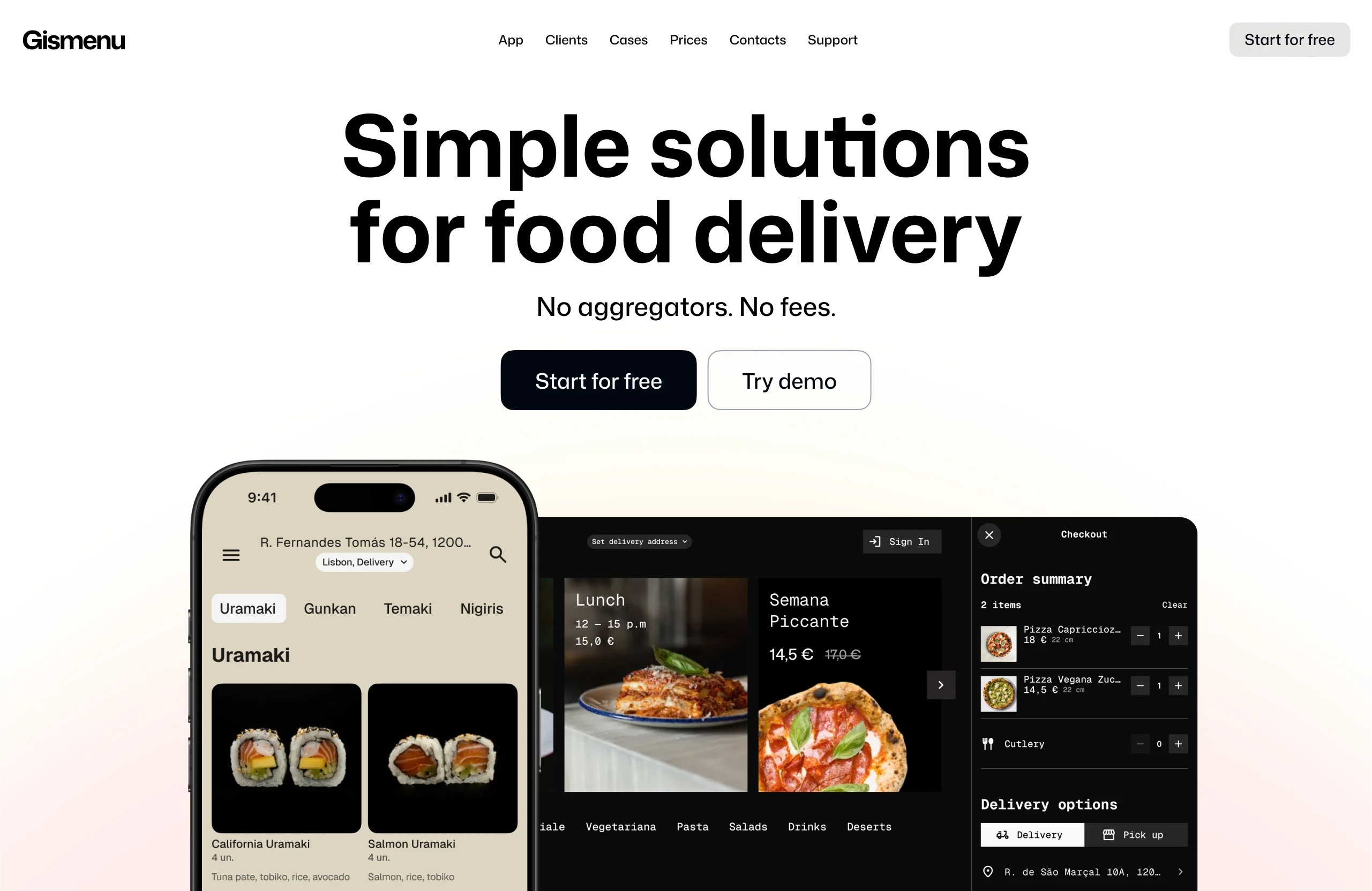
Platform for small restaurants to launch branded delivery apps.
Growth stalled due to low conversion and slow activation.
Focused on reducing friction across key flows and improving time-to-launch.
Problem
Outdated and inconsistent UI reduced trust and made the product less competitive.
Preparing client-ready layouts took ~2 hours, slowing down launches.
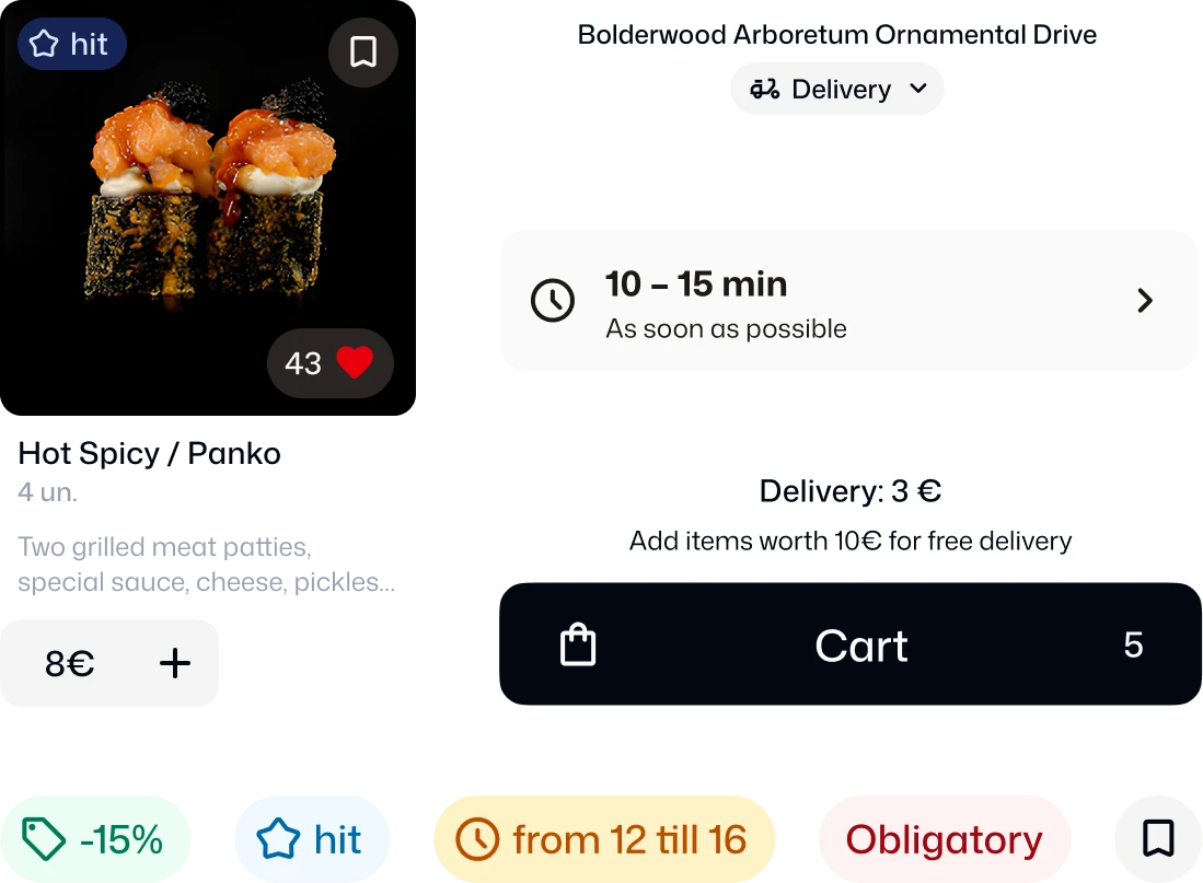
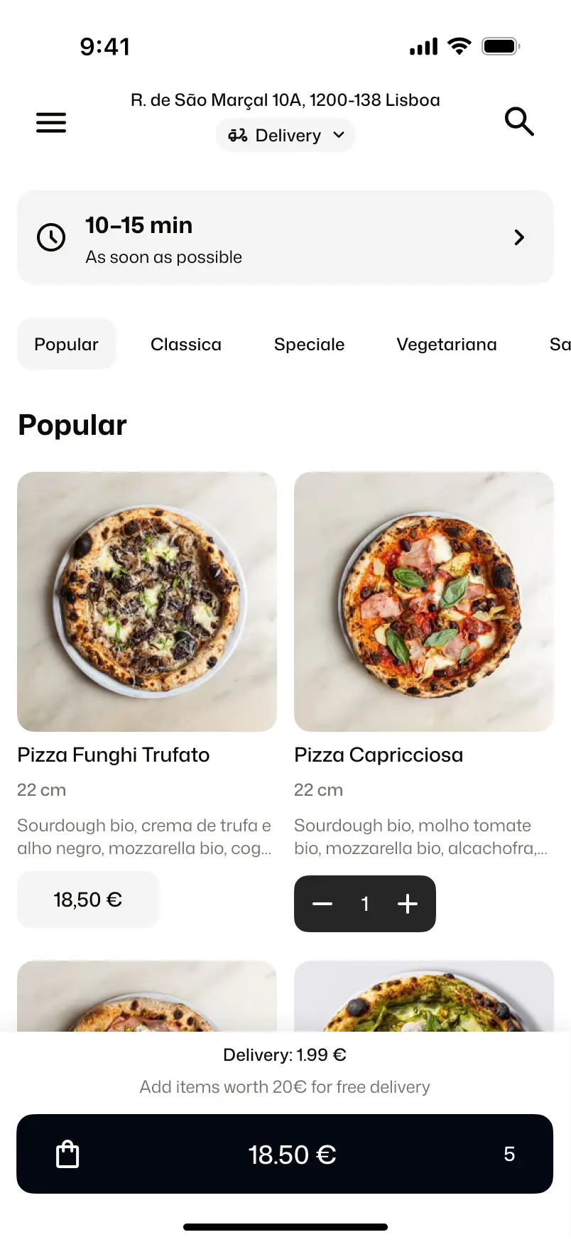
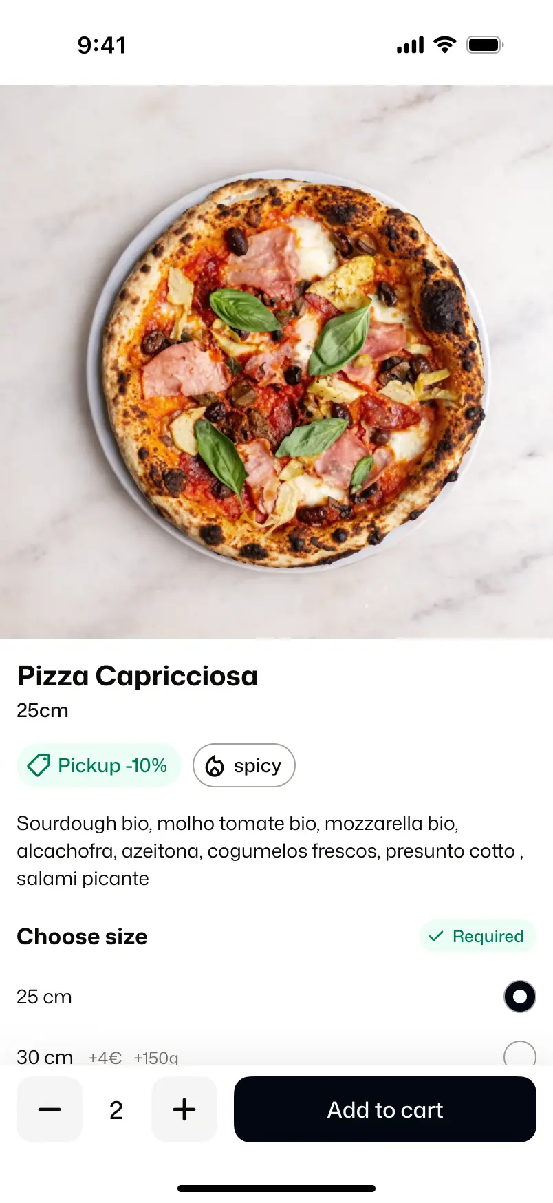
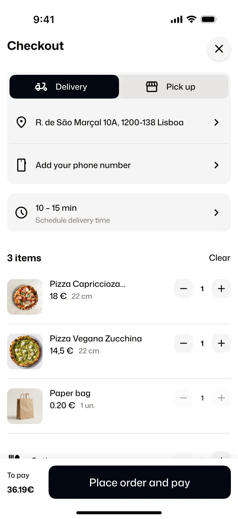
Key flows like address search and order tracking caused friction.
Focus
Reduce friction in ordering
Improve activation and clarity
Enable faster product iteration
Reducing time-to-launch
Inconsistent UI slowed down delivery and reduced perceived quality.
Standardized components and introduced tokens.
Reduced design time from 2h to ~20min and improved development speed.
Enabled faster iterations on user-facing improvements.
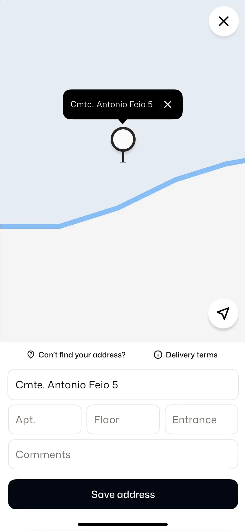
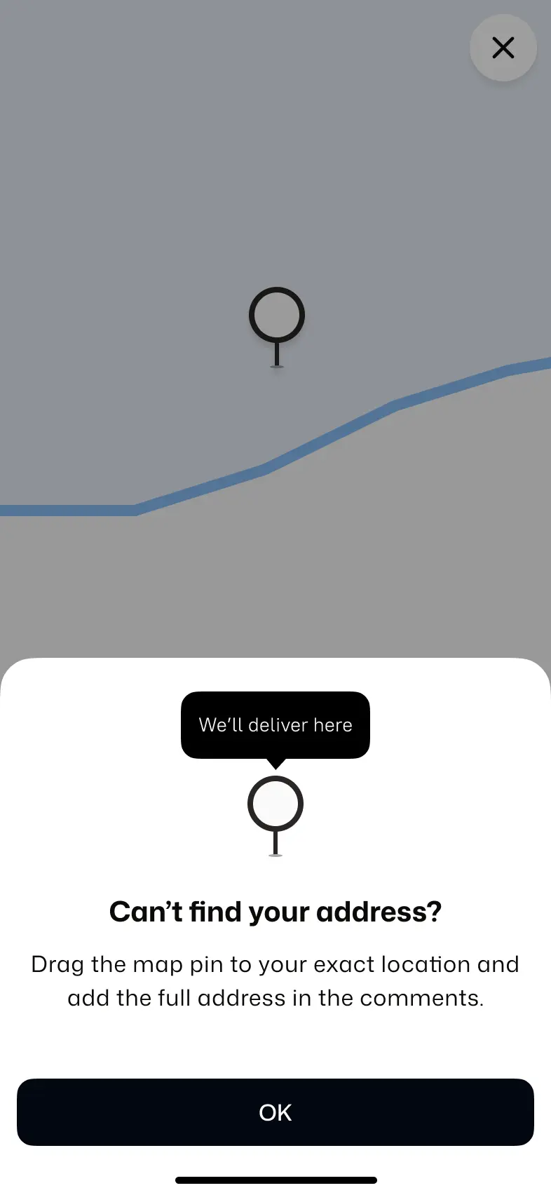
Address fallback
Users couldn’t find exact addresses due to map limitations, even though a manual pin option already existed.
Improved discoverability by adding a clear entry point with guidance.
Removed a dead-end in the ordering flow.
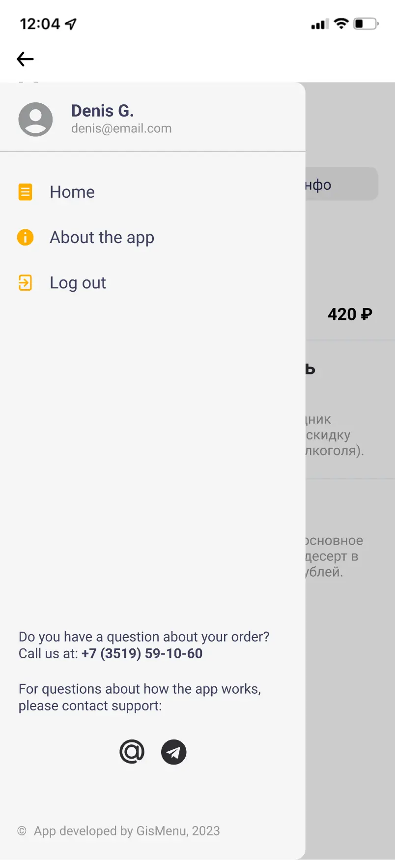
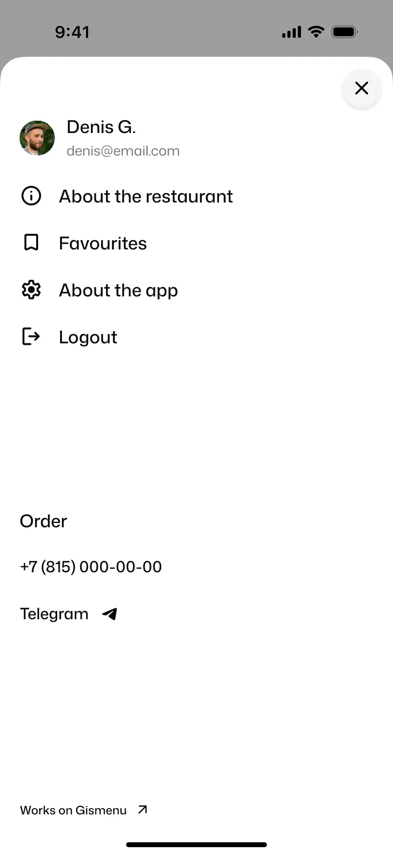
Fixing misrouted support requests
Users contacted support about orders due to competing contact options.
Separated flows by prioritizing restaurant contact and moving support to a secondary screen.
Reduced misrouted requests and clarified user actions.
Before
After
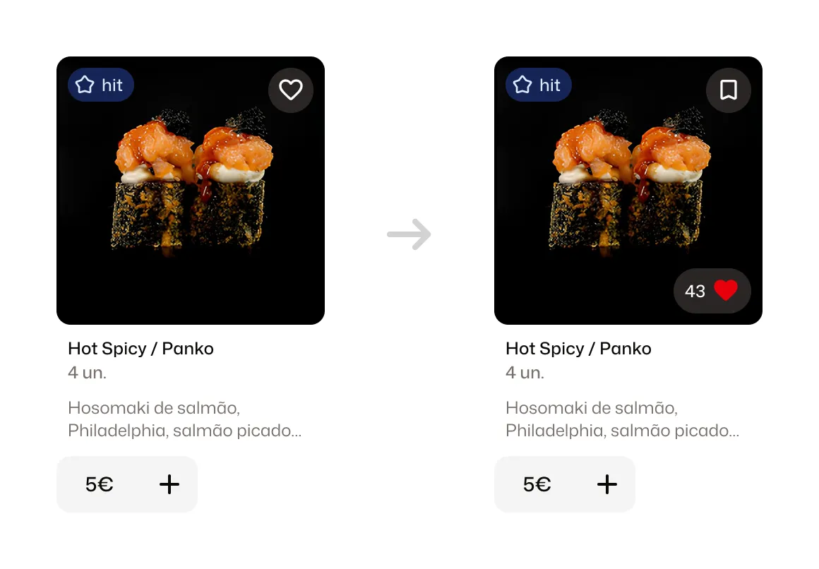
Integrating custom feature without breaking core flow
Client requested a “like” feature that conflicted with existing “favorites” and limited space on the card.
Reworked icon semantics and explored placement options to avoid competing with “add to cart”.
Integrated the feature without disrupting the primary ordering flow.
Outcome
Reduced friction across key flows and improved operational efficiency.
Enabled faster product iterations through design system improvements.
Shifted focus from UI polish to activation and clarity.
20 min
Reduced branded app setup from ~2 hours to ~20 minutes.
Shared tokens
Made brand customization predictable across client apps.
Less repetitive work
Freed up time for onboarding, trust, and product improvements.